SKY
Data driven
Homepage redesign
— BRIEF
Sky's CEO approached me to explore how we could improve the homepage experience and conversion rate.
— IMPACT
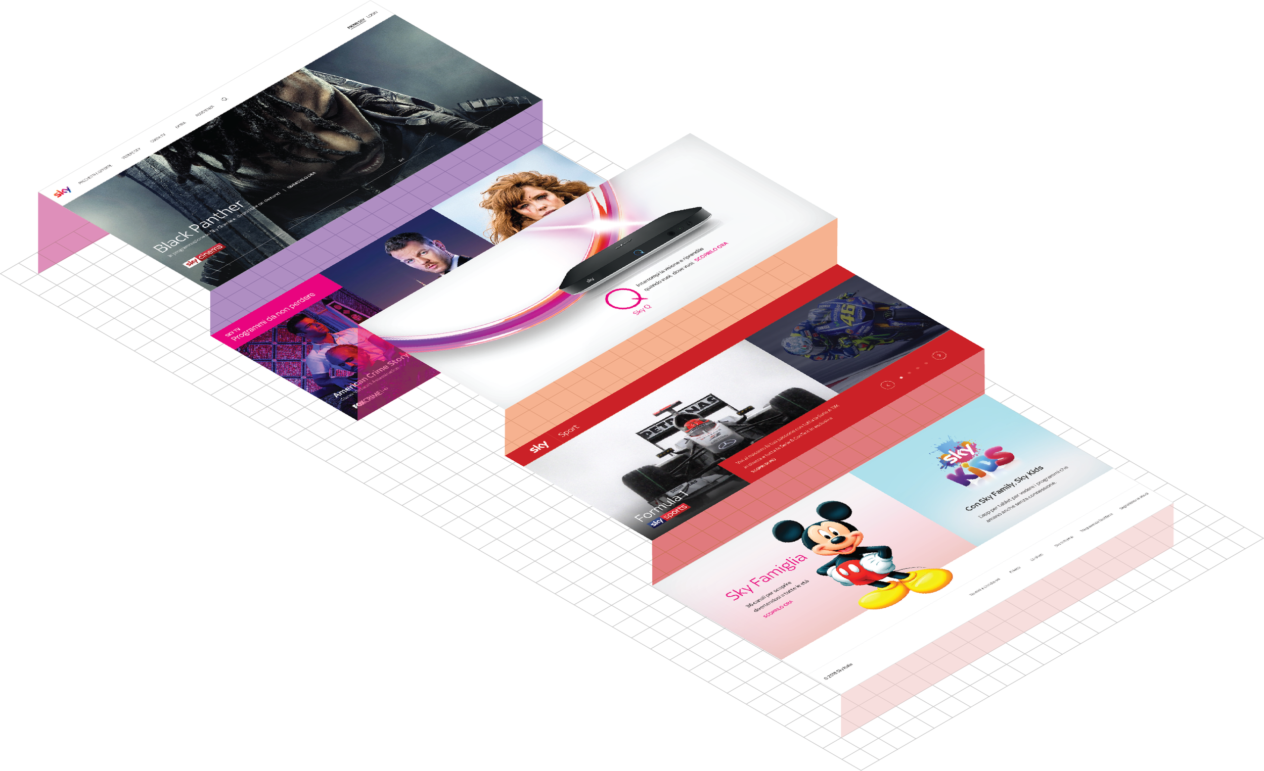
We showed Sky management what could be done to improve the homepage experience and create a much more engaging way to show their content.
COMPANY
SKY
YEAR / DURATION
2018 / 2 months
ROLE
Head of UX and UI
TYPE OF WORK
Internal Clients (C-Level) management, Data analysis, Service Design, Visual Design, Motion Design, and Interaction design
— HP DATA
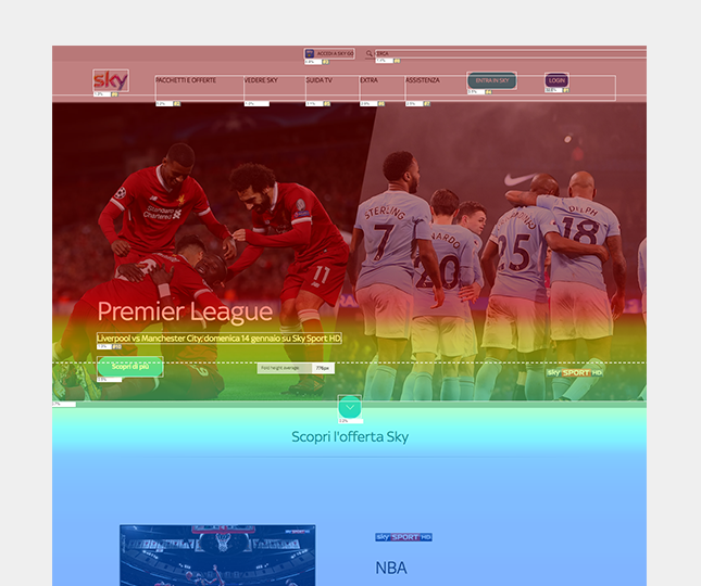
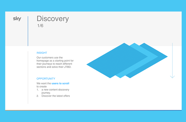
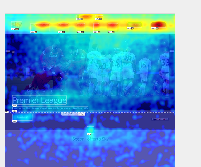
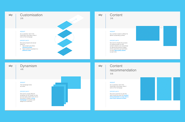
Working with a blended team of designers, researchers, and data analysts, we started by analysing journeys and heatmaps to understand user's behaviours and motivations better. At the end of the analysis, we developed insights and opportunities that guided the design process.
— HOMEPAGE V1
“DISCOVERY”
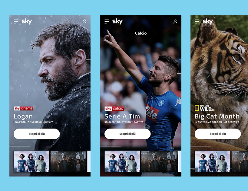
We wanted this version to be different from what Sky's clients experience on Sky's Homepage.
We worked on the following assumption based on quantitative data:
- Users mainly use the Homepage to navigate to other pages. By creating a more engaging design based on personalised content and better navigation, users would scroll down the page
- By serving content that would resonate with users and making explicit the actual value exchange (brilliant content) would push users to subscribe (prospect) or upgrade (clients).
— HOMEPAGE V2
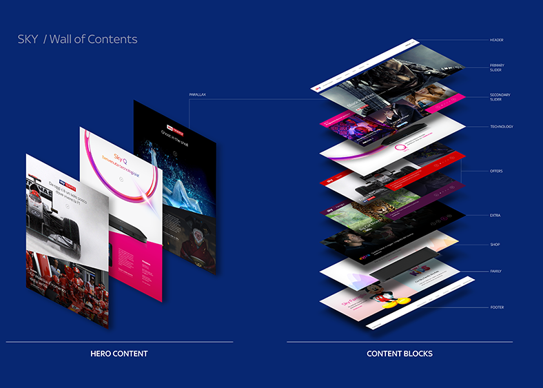
CONTENT WALL
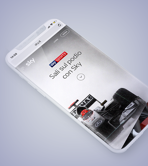
This version had to be more conservative but still use rich, personalised content as the main reason users scroll and explore the Homepage.
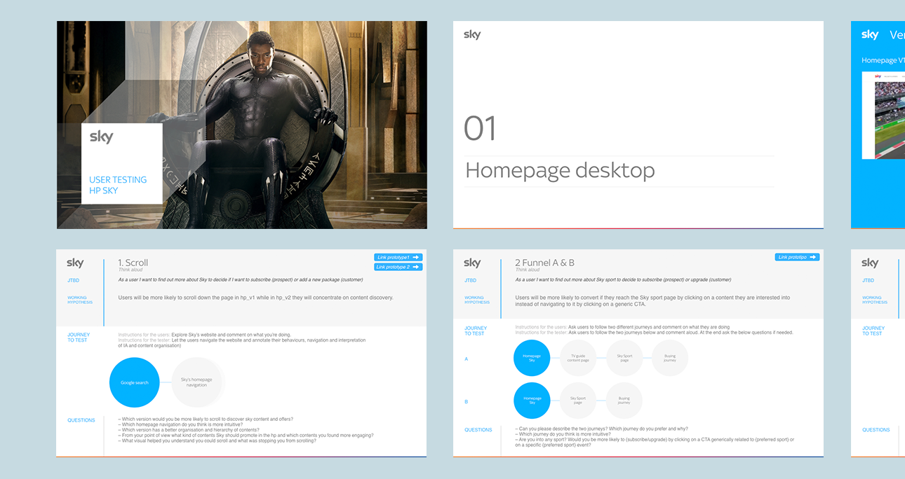
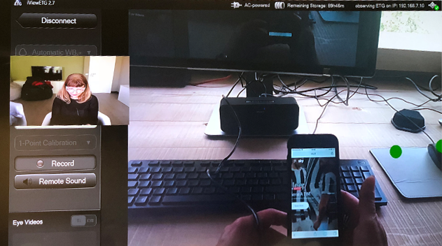
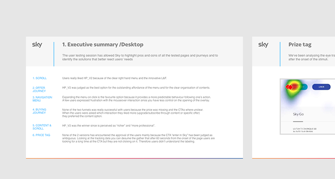
— USER TESTING
Before presenting the two versions of the homepage to internal stakeholders, we wanted to validate our hypothesis. We organised a user testing session where we asked users to perform a few tasks on both desktop and mobile platforms.